Design inspiration curated from X
Salt & Knot’s identity proves less can be more. The Novel Co. used... - The Brand Identity
Published by The Brand Identity on August 28, 2025.
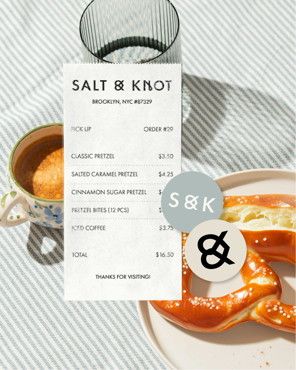
Design notes
Salt & Knot’s identity proves less can be more. The Novel Co. used Futura with custom touches – a pretzel-shaped ampersand and knot detail in the ‘N’ – plus an unexpected peach and blue palette instead of typical bakery browns. Explore their complete portfolio below ↓
This entry is part of MotionVault's curated archive of interface, product, brand, website, and motion design references from public creators on X.
Image rights and licensing remain with The Brand Identity; use the original X post for source and licensing inquiries.
Deep Clone · React 19 + Framer Motion
Interactive Sandbox & Production Code
Reverse-engineered 1:1 component with spring physics, accessible keyboard controls, and modular Tailwind CSS.
Reference details
- Creator
- The Brand Identity
- X handle
- @TweetsByTBI
- Published
- August 28, 2025
- Media
- 3 visual references
- Views
- 5,287
- Likes
- 92
- Bookmarks
- 40